Unlocking Expressive Freedom Beyond Commercial Craft Packs
Commercial scrapbook collections make beginning easy, but they can also quietly narrow your creative choices. A coordinated paper pack often arrives with its colors, patterns, and accents already decided. That convenience is useful for a quick card or journal page, yet repeated reliance on bundled sets can make different projects begin to resemble one another. Custom palette building offers a more flexible path. Instead of asking which kit matches the project, you begin with the mood, story, or focal image and select colors that serve it.
That shift is where color theory becomes practical rather than academic. Classical relationships such as analogous and split-complementary harmony help turn unrelated ephemera, inks, acrylics, gel sticks, and found papers into a unified visual language. The process is not about eliminating experimentation. It is about giving experimentation a reliable structure. As you move from raw pigments to transparent washes, painted marks, and layered scraps, intentional color decisions create cohesion while preserving surprise. The result is artwork that feels less like an assembly of supplies and more like a recognizable artistic voice.
Color Relativity and the Foundation of Mixed Media Depth
Color does not operate in isolation. A blue-gray scrap placed beside orange may appear cooler and more luminous than the same scrap surrounded by muted blue. A medium gray can look dark against white and unexpectedly light against charcoal. This principle, known as color relativity, explains why a pigment that looked perfect on a palette may seem too dull, bright, warm, or cool once it enters a layered composition. Backgrounds, neighboring hues, value, temperature, and saturation all influence perception.
For mixed media artists, value contrast is especially important because many materials accumulate quickly. Paper fibers, printed lettering, dried brush marks, and translucent washes can merge into visual mud when everything occupies the same middle range. Before adding more color, inspect the composition in grayscale, either by squinting or using a phone camera filter. Identify at least one clearly light area, one dark anchor, and several middle values. Strong contrast can direct attention toward a focal point, while lower contrast can create a quieter atmospheric passage. A useful contrast checklist includes:
- Separate the focal area from its surroundings through value, temperature, or intensity.
- Repeat one light, dark, or muted tone in several locations to connect distant layers.
- Reserve the strongest contrast for the areas that deserve the most attention.
- Test colors on the actual substrate because paper tone and texture can alter their appearance.
Translucency adds another level of complexity. Diluted acrylic, drawing ink, gel-stick pigment brushed with water, tracing paper, and deli paper can allow earlier marks to remain visible. Opaque gesso, heavy-body paint, pasted cardstock, and thick impasto can cover them almost completely. Guides to mixed media layering techniques emphasize that translucent layers can build depth, while gesso and acrylic can prepare or unify a surface. Plan the sequence deliberately: establish broad transparent color, place collage, reinforce selected forms with opaque passages, and save thick highlights or scratched details for later.
Two Powerhouse Formulas for Balanced Visual Tension
An analogous palette uses neighboring hues on the color wheel, usually three related colors supported by a dominant “mother” color. Blue, blue-green, and green can create a calm journal spread; yellow, yellow-orange, and orange can suggest warmth and sunlight. Because the hues share visual DNA, they move smoothly across a page. Varying their values and saturation prevents the result from becoming flat. A pale blue wash, a middle-value teal scrap, and a deep green mark can feel far more dimensional than three equally intense colors.
A split-complementary palette begins with one base hue and adds the two hues on either side of its complement. For example, a blue foundation can be energized with yellow-orange and red-orange accents. The relationship creates focal contrast without the blunt opposition of a direct complementary pair. It is particularly useful when a collage needs a clear point of emphasis but still requires harmonious neutrals and supporting transitions. The following guide helps match each formula to an intended outcome.
| Palette formula | Typical mood | Focal balance | Ideal craft applications |
|---|---|---|---|
| Analogous | Calm, atmospheric, unified | Gradual emphasis through value and saturation | Nature journals, dreamlike spreads, background fields, vintage pages |
| Split-complementary | Energetic, structured, expressive | Clear focal contrast with controlled variety | Portrait studies, bold collage centers, illustrated cards, statement pages |
Developing Your Signature Swatch Record Across Varied Mediums
A color is not finished when it looks attractive in its container. It must be tested on the surface where it will live. A vintage journal page may be cream-colored, absorbent, and already marked with stains. Gel sticks may appear opaque when applied dry but become translucent when activated with water. Encaustic and oil-based materials can shift the apparent depth and sheen of a mixture. Even the same acrylic color may look different over white gesso, raw chipboard, dark paper, or a previously stained surface.
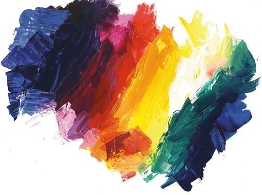
A visual swatch ledger turns these variables into useful information. Record the medium, substrate, dilution, layering order, and drying result rather than relying on memory. Artist Julie Snidle”s palette approach highlights the value of testing small combinations, adding white for tints and neutrals, and keeping limited palettes flexible as a work develops. Pure, single-hue pigments are particularly valuable because they let you create specific mixtures instead of accepting the fixed character of premixed colors. Build a cohesive triad with the following process:
- Choose three single-hue pigments based on a clear direction, such as a cool blue, a warm yellow, and a red-violet.
- Paint each color at full strength, diluted, and mixed with white or a neutral on the intended substrate.
- Combine the pigments in pairs, then create a three-color mixture to discover bridging neutrals.
- Arrange the swatches together and remove any color that overwhelms the others or fails to support the intended mood.
- Record successful ratios, drying changes, and compatible materials in the ledger before beginning the final artwork.
Layering Collage Ephemera and Inks in Perfect Balance
Once a palette is established, the 60-30-10 distribution rule provides a practical framework for applying it. Treat approximately 60 percent of the surface as the dominant color family, often through a painted ground, gesso tint, or broad wash. Use about 30 percent for supporting mid-tones in papers, secondary marks, and connected shapes. Reserve the final 10 percent for the most dynamic hue, such as a vivid ink line, a small painted symbol, or a sharply colored scrap. The percentages do not need to be measured literally. Their purpose is to prevent every color from competing equally.
Found ephemera rarely arrives in the exact palette required. A magazine fragment may contain an unexpected red, a ticket may introduce a harsh white, or an old label may carry saturated commercial printing. Instead of discarding these materials, lower their visual volume. A translucent glaze made with diluted acrylic can tint a scrap while preserving its type and texture. Water-soluble washes can soften the edge of printed areas, while thin gesso can veil distracting detail. The goal is not to erase the history of the object, but to bring it into conversation with the surrounding colors.
Layering works best when each material has a defined role. Transparent deli paper can create atmospheric depth, drawing ink can supply drips, lettering, and directional movement, and opaque paint can clarify forms that have become indistinct. Collage technique references also recommend thin paper layers and careful sequencing, with heavier impasto applied late so it does not interfere with gluing. Consider these balancing strategies:
- Repeat a small accent color in three or more locations to create rhythm.
- Use a glaze over a high-contrast scrap when its pattern is useful but its color is disruptive.
- Place the brightest mark near the focal area and echo it more quietly elsewhere.
- Allow some edges to disappear beneath washes while keeping selected edges crisp for structure.
- Use neutral gray, softened cream, or palette-derived brown to connect colors that do not naturally belong together.
An analogous blue-green journal spread demonstrates how little is required for convincing harmony. A blue wash, green heavy-body marks, water-soluble pencil, white gesso, and transparent deli paper can create depth without a large collection of coordinated products. Conversely, a split-complementary design might use a muted blue ground, ochre paper, and small coral ink accents. In both cases, harmony comes from repeated relationships, controlled values, and deliberate layering rather than from purchasing every material in a matching kit.
Step Up to the Canvas with Intentional Palette Confidence
Building custom color schemes gives mixed media work greater freedom and greater identity. Store-bought packs can remain useful sources of paper and pattern, but they no longer dictate the emotional direction of a page. Analogous palettes offer a dependable route to atmosphere and continuity, while split-complementary palettes bring focus, tension, and energy. Color relativity, value planning, and medium testing ensure that those formulas remain adaptable rather than rigid.
Begin today with three supplies already on the art desk. Swatch each one on the real substrate, dilute or soften the colors, mix a few bridges between them, and place the samples side by side. Record what succeeds, then use that triad in a small journal spread before committing to a larger canvas. Each test builds a stronger visual vocabulary. With repeated practice, small shifts in color selection become meaningful progress toward artwork that feels cohesive, intentional, and unmistakably yours.